Client Name / Aurora Insight Project / Brand Identity & Brochure
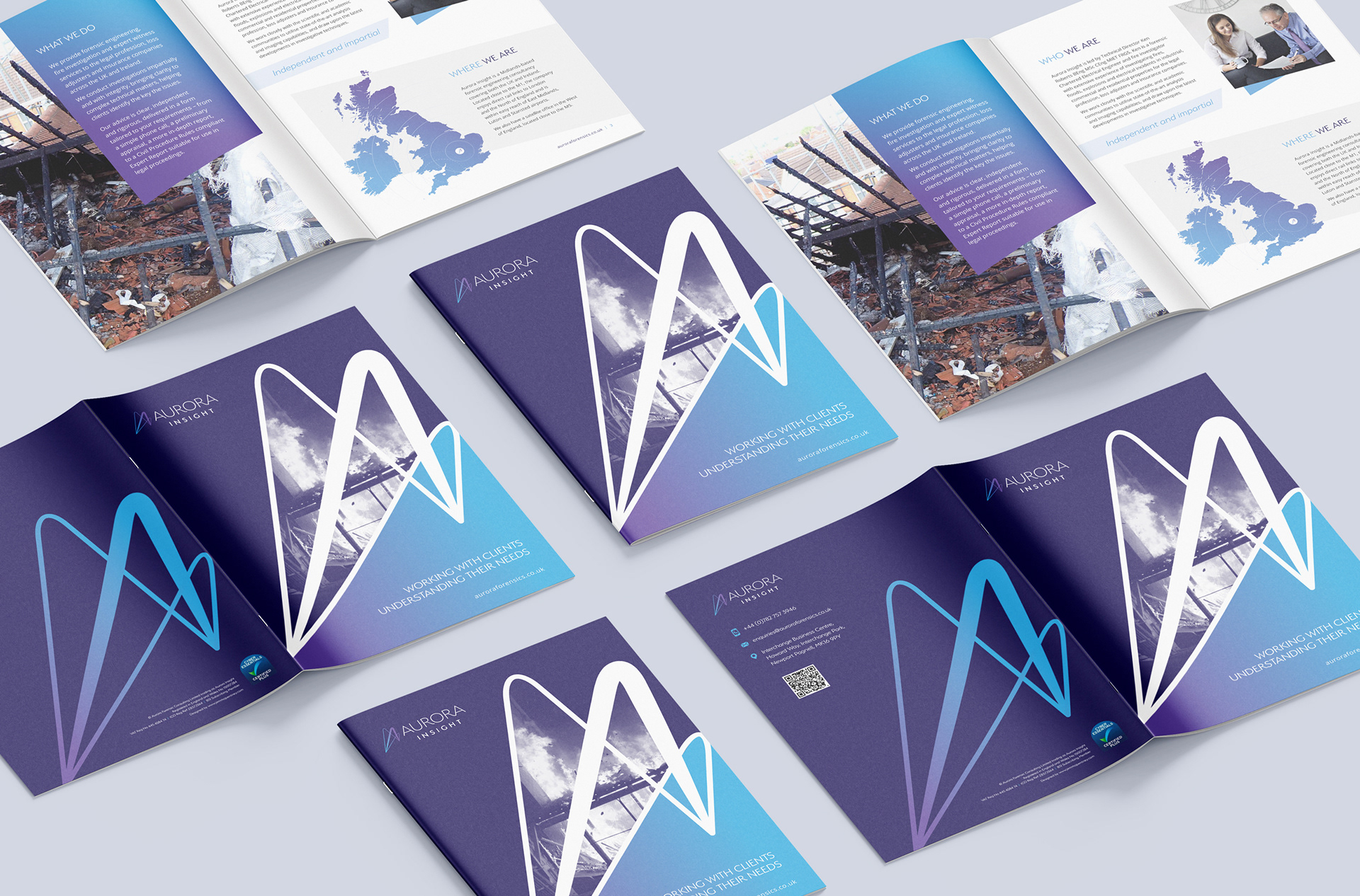
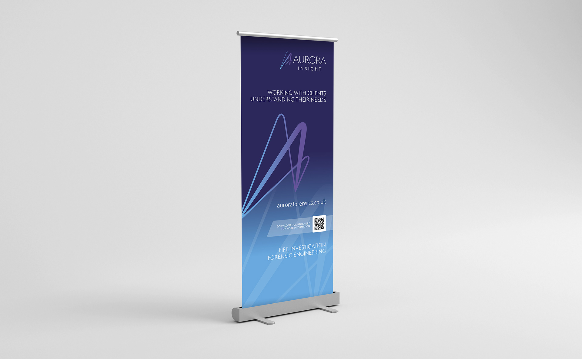
I was approached by start-up Aurora Insight, initially to design a logo. They are specialists in forensic engineering and based in the UK and Ireland. There was no branding at all in existence, and they needed to create an identity, from which to product consistent client documentation, stationery, a brochure and a website.
The client was very clear in their direction; wanting a sharp, uncluttered look to the logo that conveyed ‘clarity’. They requested an icon alongside a word mark, inspired by the company name and the Northern Lights (Aurora Borealis). They expressed a preference for cool, bright colours and fresh, modern, light/thin fonts.
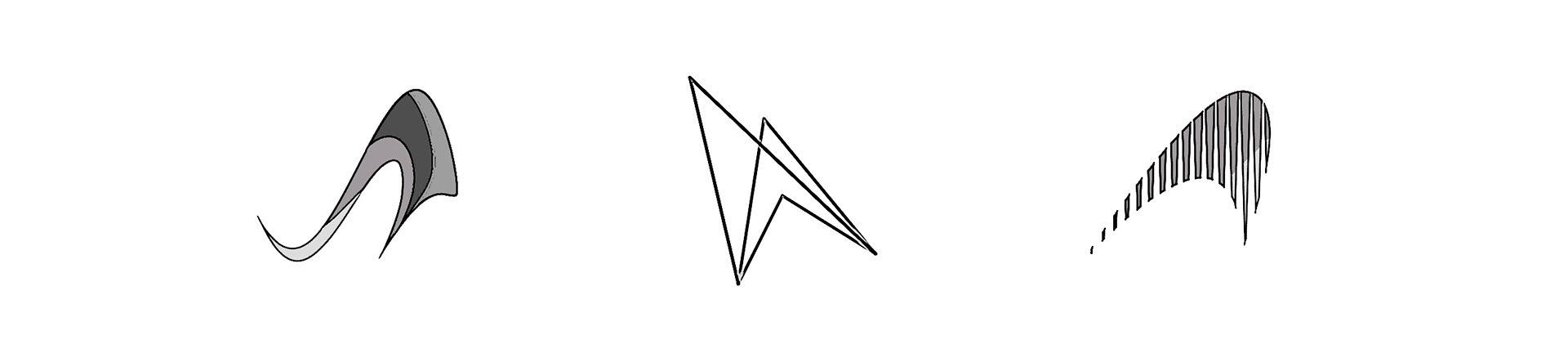
Some early logo symbol concepts.
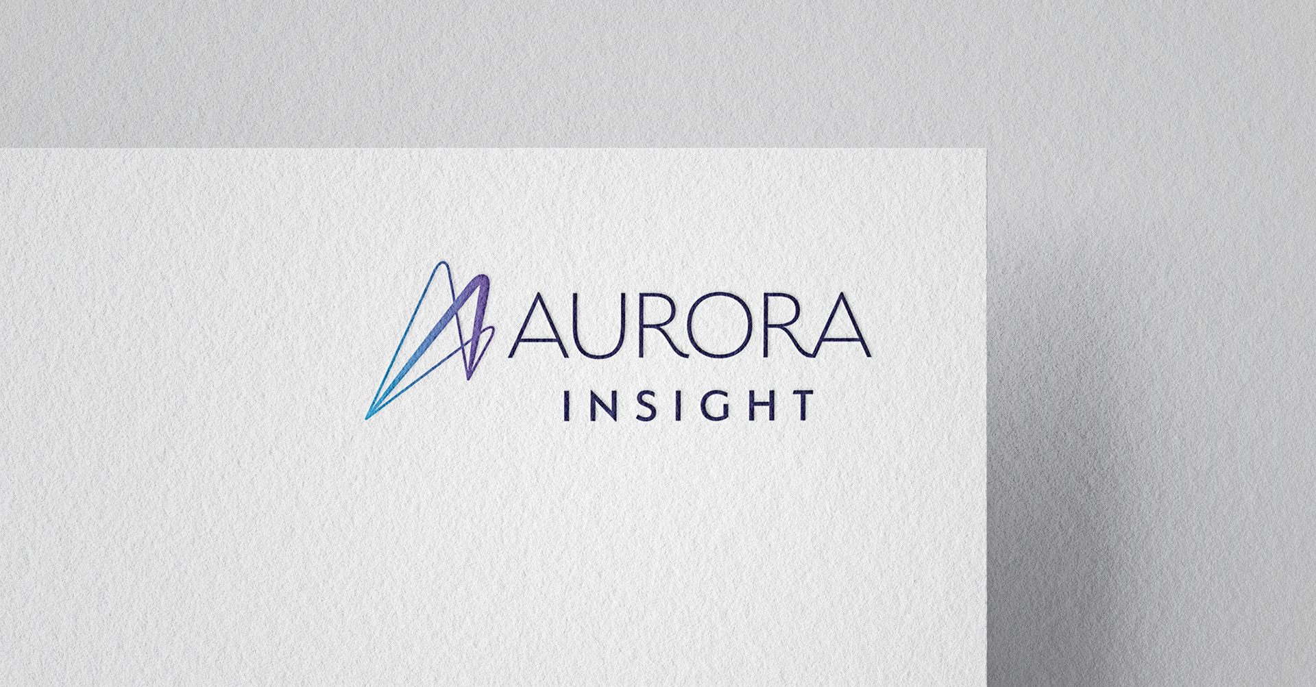
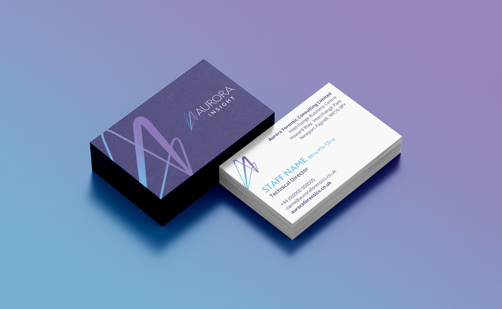
The final logo design (above) and some printed collateral (below).
"Jemma completely got our briefs and concepts, creating a bold and refreshingly uncluttered logo and incorporating this into a range of suitably branded cards, reports and correspondence templates, all very well received by our clients. It’s been an absolute pleasure working with her."
Ken Roberts / Technical Director, Aurora Insight