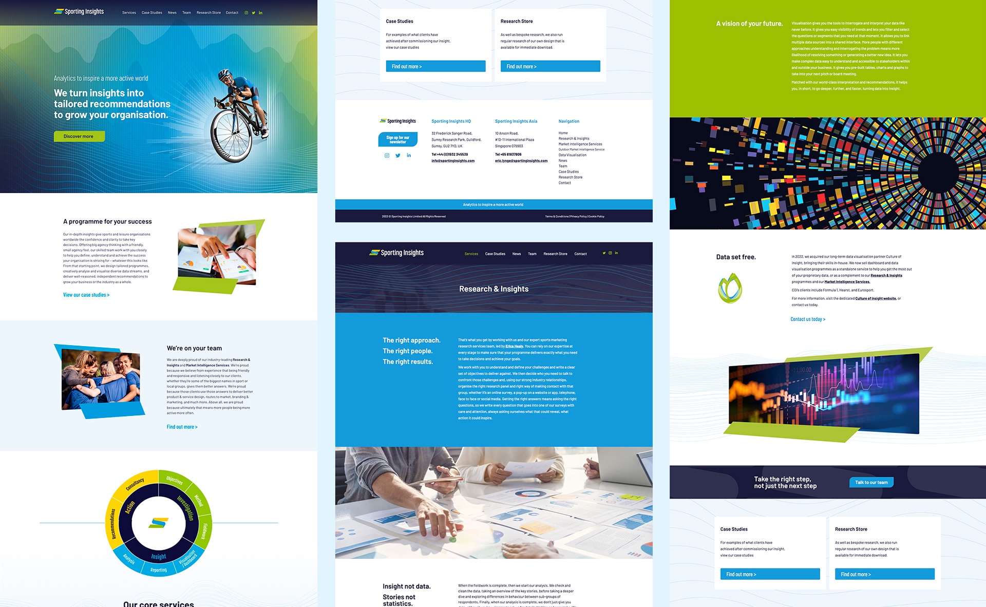
Client Name / Sporting Insights
Project / Logo & Website Design (Web built by joannacraig.co.uk)
Project / Logo & Website Design (Web built by joannacraig.co.uk)
Sporting Insights specialise in sports research / insights and market intelligence and I have worked with them for a few years now.
Having previously been called 'Sports Marketing Surveys', they wanted to change their name as they felt it was too specific for their current offerings (they do much more than surveys!) and along with this give their logo a refresh.
Their priority was to keep a similar look, so there was a link back to what they had previously and they were still recognisable. They were keen to keep the colour palette – the colours represent, grass, sea and sand.
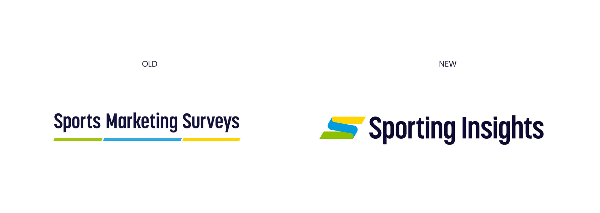
I did several drafts with variations of the line graphic before the client settled on the three lines making up the 'S' shape. We kept the same font for recognition which also worked quite nicely as the new name had less letters allowing a better ratio between the icon and the wordmark. The 'S' icon gave us a brand device which worked well as a graphic across marketing collateral.

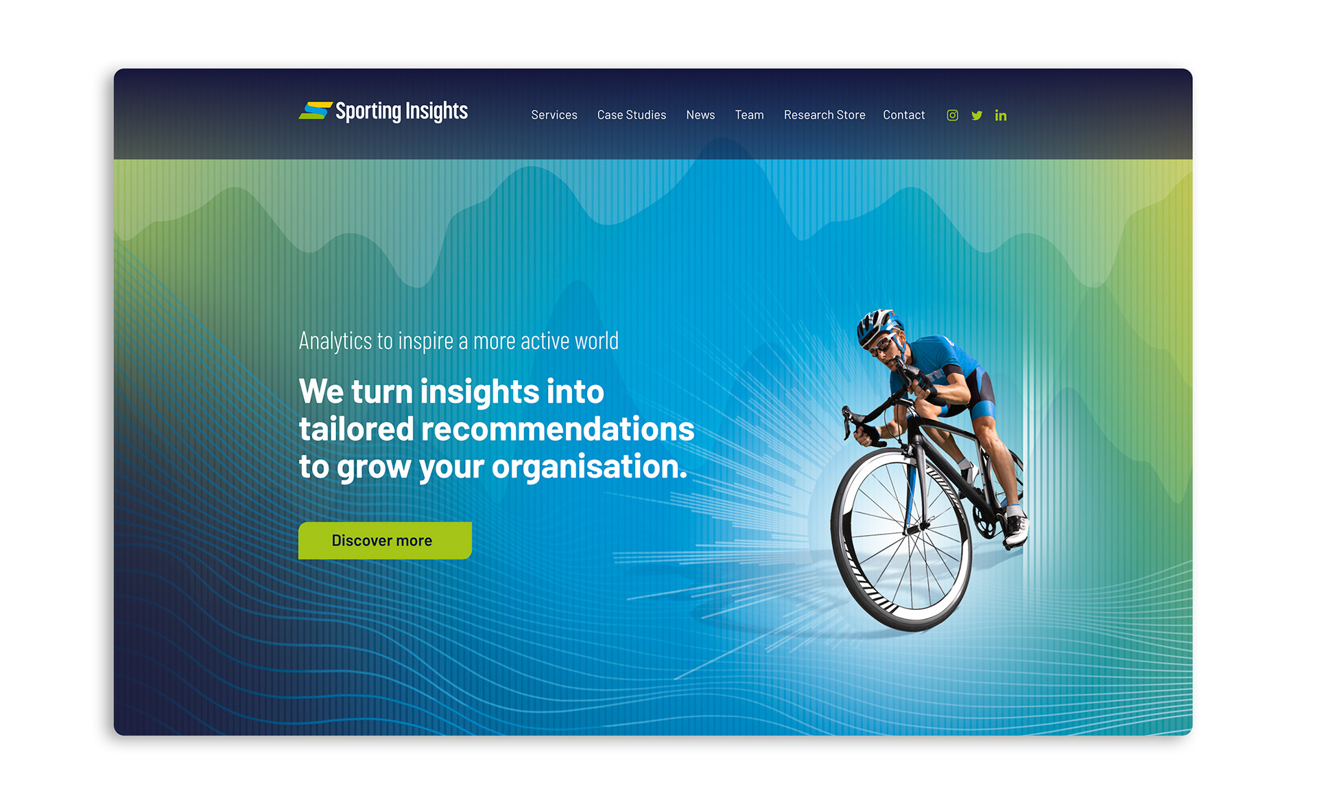
I was asked to redesign the website once the new logo was finalised to bring everything up to date. They wanted to convey their core sports on the home page, so I created a series of graphics for the home page carousel, using abstract data patterns and backgrounds and action shots from their core sports.